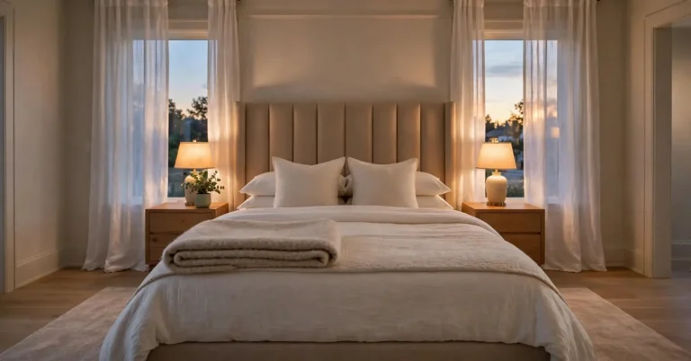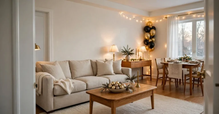

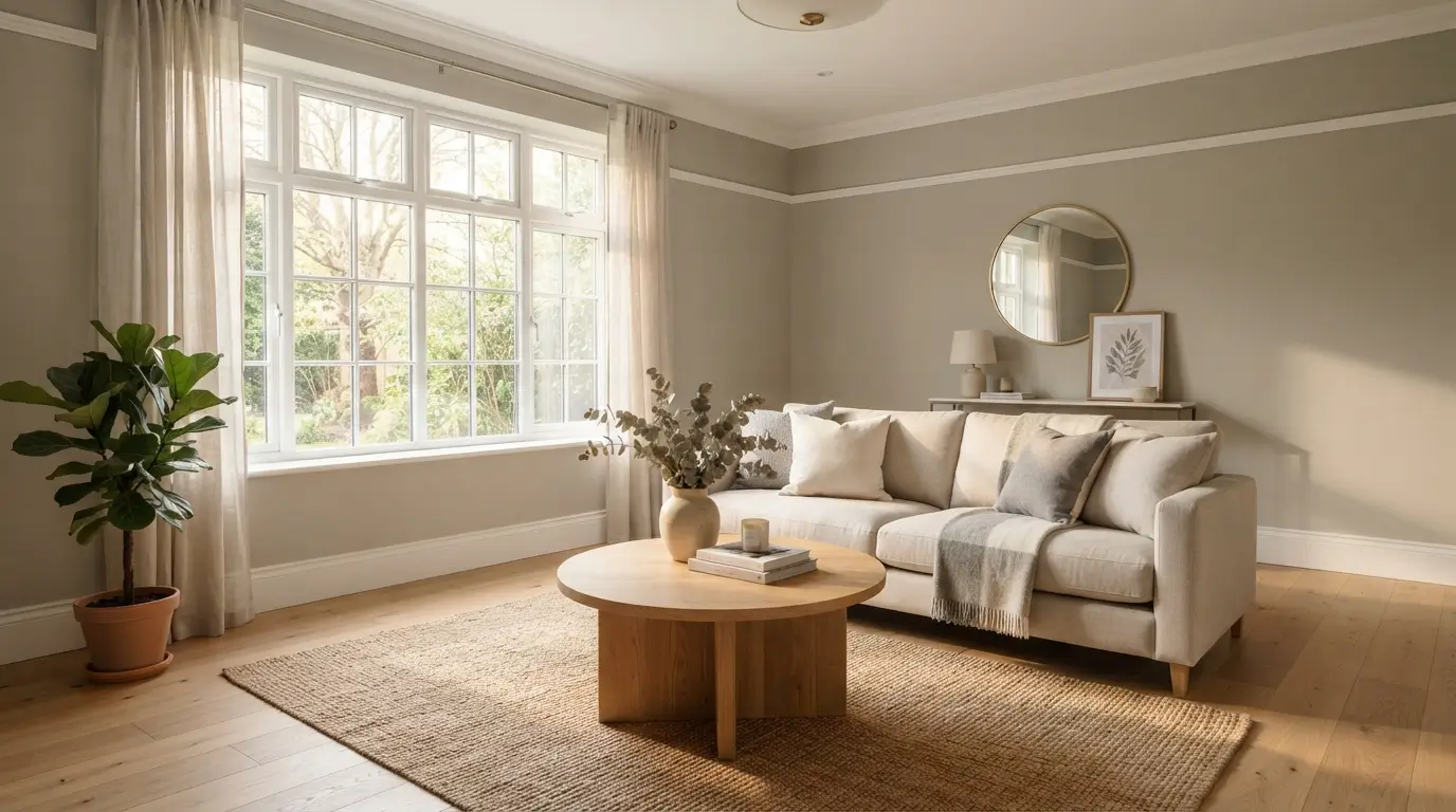
Edgecomb Gray is one of the most trusted neutral paint colors from Benjamin Moore. It has a Light Reflectance Value of 63, which puts it in the medium light range. This shade leans warm, with undertones that can shift between green, beige, and soft pink depending on your light. It works well on walls, cabinets, and exteriors. It pairs best with warm whites like White Dove and Chantilly Lace. It does not pair well with cream cabinets or violet gray tones like Collingwood. This guide covers the science behind the color shift and the best rooms for it. It also covers the colors that clash and how it compares to Revere Pewter, Accessible Beige, and Pale Oak.
What Color Is Benjamin Moore Edgecomb Gray?
This shade is not a true gray. It is not a true beige either. It sits in a category paint pros call greige-taupe. That means it borrows warmth from beige and softness from gray without fully committing to either one.
That in-between quality is exactly why homeowners love it. It reads as neutral in almost any room. It does not fight with wood tones. It does not clash with white trim. And it rarely feels cold, even in rooms with less natural light.
This paint belongs to Benjamin Moore’s Historical Collection, under the code HC-173. It has been a top seller for years. Edgecomb Gray remains one of the most searched paint colors in North America.
What’s the Difference Between Edgecomb Gray and Baby Fawn?
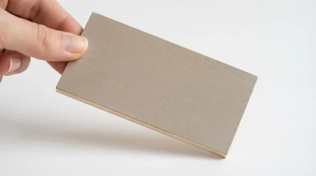
There is no real difference. HC-173 is the exact same formula as Baby Fawn OC-15. Benjamin Moore also sells it under a third name, Alaskan Skies 972, depending on which paint deck you shop from.
The formula inside the can is identical. Only the label changes. Some designers use the name Baby Fawn more often now. Gray sounding names have become less trendy. Warm neutrals stay popular.
What Is the LRV of Edgecomb Gray?
This color carries an LRV of 63.09, according to Benjamin Moore. LRV stands for Light Reflectance Value. It measures how much light a paint bounces back, on a scale from 0 to 100. Pure black sits at 0. Pure white sits at 100.
An LRV of 63 places this shade in the medium light range. It is light enough to brighten a room without washing out. It is deep enough to still register as a real color instead of an off white.
For comparison, Revere Pewter has an LRV near 55, making it noticeably darker. Pale Oak sits near 69, making it lighter and airier. This one lands right between the two.
Is Edgecomb Gray Warm or Cool?
This paint is a warm neutral. It leans toward beige and green rather than blue or violet. In most lighting, it reads soft and inviting rather than stark or cold.
Warmth in paint is never fixed, though. Your bulbs, your flooring, and even your landscaping outside the window all pull a color in different directions. This is normal for any warm neutral, not a flaw unique to this one.
What Are Edgecomb Gray’s Undertones?
This is the question that trips up the most homeowners. This shade has minimal undertones, which sounds simple but actually makes it trickier to predict.
Most paint colors commit hard to one undertone. This one does not. In some rooms it reads slightly green. In others, especially under warm bulbs or next to cream trim, it can flash a soft pink or mauve. Near strong afternoon sun, it can look almost beige.
Here is why that happens. Paint colors shift due to a phenomenon called metamerism. A color looks different depending on the light source hitting it. Light bulbs are rated by Kelvin temperature. Bulbs under 3000K read warm and yellow. Bulbs above 4000K read cooler and white. A warm bulb pulls more beige and pink out of Edgecomb Gray. A cooler bulb pulls more green and gray.
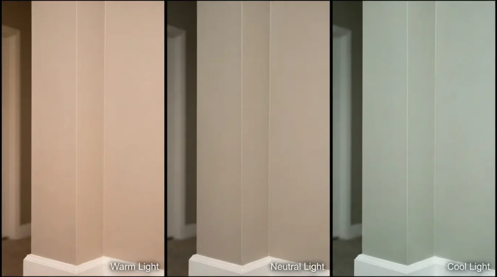
Nearby colors also play a role. Green and red sit opposite each other on the color wheel. A room with heavy outdoor foliage can push Edgecomb Gray toward looking slightly pink by contrast. A room full of cream or yellow undertoned finishes can do the same thing.
This is not a defect in the paint. It is simply how a low commitment neutral behaves. The fix is always the same. Test a large sample on your actual wall. Check it under your actual lighting, at different times of day, before you paint the whole room.
Is Edgecomb Gray Still Popular in 2026?
Yes. Homeowners have moved away from the flat, cool grays that dominated the last decade. Warm neutrals, along with beige and taupe tones, are back in demand. This shade has stayed relevant because it never fully committed to the cool gray trend in the first place. It aged better than most of its competitors.
Edgecomb Gray Comparison Table
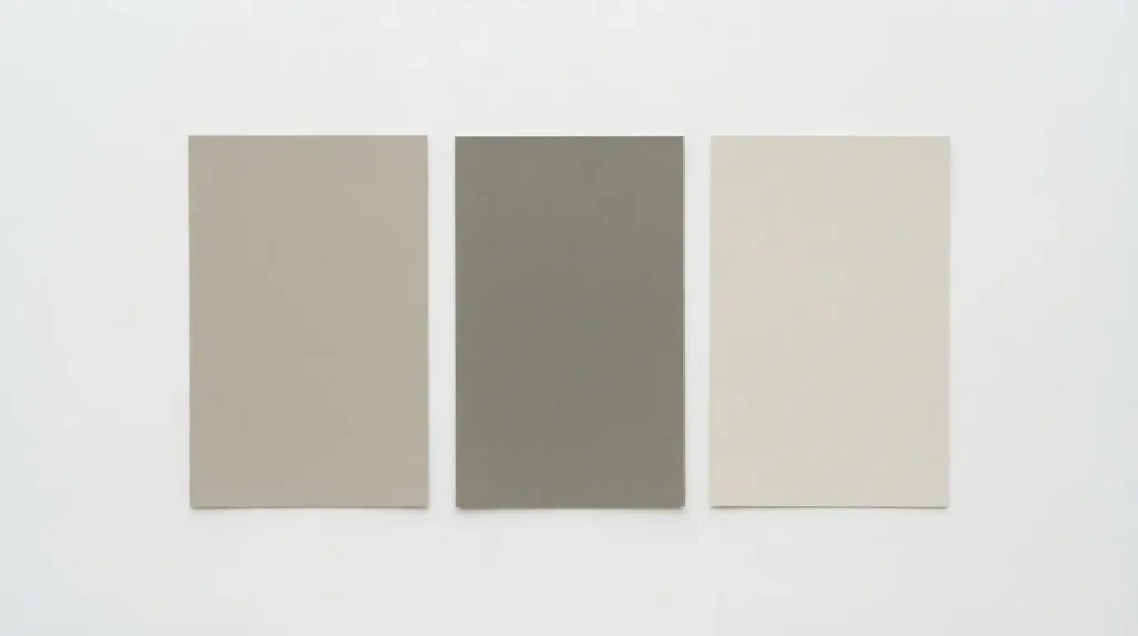
Use this table to see how this shade stacks up against the neutrals it gets compared to most often.
| Color | Brand | LRV | Undertone | Best For |
| Edgecomb Gray HC-173 | Benjamin Moore | 63 | Green beige, minimal | Whole house, cabinets, exteriors |
| Revere Pewter HC-172 | Benjamin Moore | 55 | Warm gray green, deeper | Rooms needing more depth |
| Pale Oak OC-20 | Benjamin Moore | 69 | Soft, airy greige | Bright rooms, ceilings, trim |
| Manchester Tan HC-81 | Benjamin Moore | 63 | Same base, more beige | Pairing as a duo |
| Agreeable Gray SW 7029 | Sherwin Williams | 60 | Cooler, more violet gray | Cool toned rooms |
| Accessible Beige SW 7036 | Sherwin Williams | 58 | Warmer, more yellow | Very warm, sunny spaces |
| Accolade SW 9516 | Sherwin Williams | Similar range | Closest SW match | SW loyal buyers |
Light Direction and How It Changes the Color
Light direction changes how any paint performs. This shade is no exception, though its low commitment undertone makes the shift more noticeable than usual.
North facing rooms get soft, cool, indirect light most of the day. In this exposure, the paint tends to lean slightly gray and can look a touch cooler than expected.
South facing rooms get strong, warm light for most of the day. Here, the color often looks brighter and can edge toward beige.
East facing rooms get warm morning light and cooler afternoon light. Expect a visible shift between morning and evening.
West facing rooms get intense, warm afternoon sun. The paint can look noticeably warmer, sometimes even slightly pink, during peak sun hours.
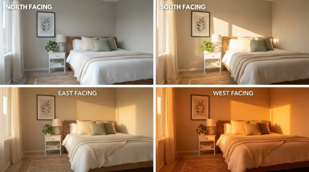
None of these shifts mean the color is wrong for your room. They mean you should sample it in your specific space, not just trust a photo online.
Lightening or Darkening the Formula
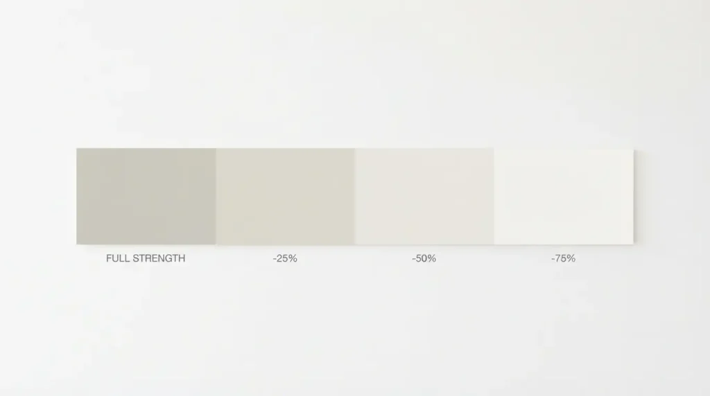
Some homeowners want a softer or deeper version of this shade. Paint stores can adjust the formula in percentages.
At 25 percent lighter, the shift is subtle. Most people barely notice a difference beyond a slightly brighter wall.
At 50 percent lighter, the change is clear. The color moves closer to an off white while keeping a whisper of the original greige base.
At 75 percent lighter, it essentially becomes an off white. This version can pick up more pink than the full strength paint, so sample it carefully before committing.
Darkening works the same way in reverse. Most homeowners prefer to simply choose Revere Pewter instead. Revere Pewter was built for that deeper range from the start.
Where This Color Works Best
On Walls
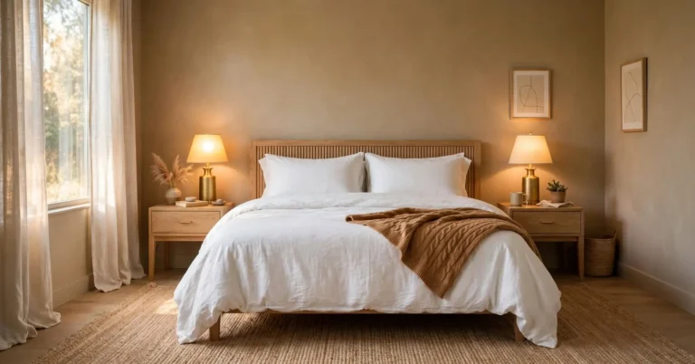
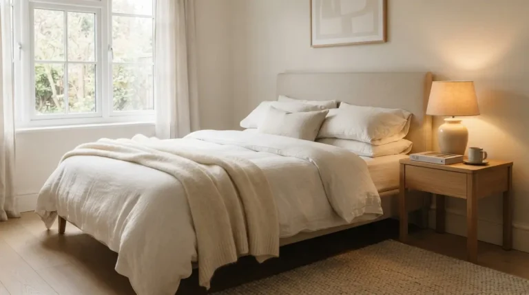
This is the most common use, and for good reason. Edgecomb Gray works in bedrooms, living rooms, and open concept spaces. It flatters wood tones.It stays neutral next to most furniture. It holds up in both bright and average lighting. If you want to see how a related warm neutral performs in a bedroom, check out these bedroom tan ideas.
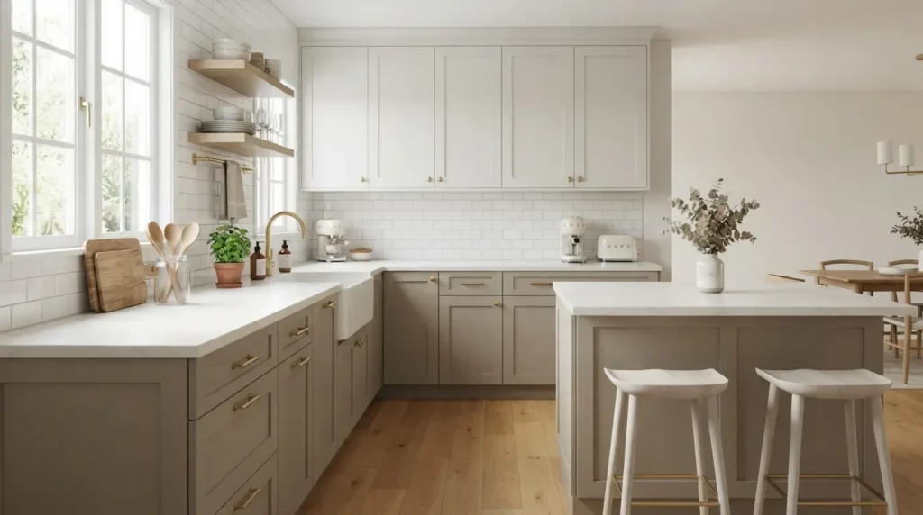
Edgecomb Gray Kitchen Cabinets
This shade makes a strong cabinet color, especially for homeowners who want a break from all white kitchens. It pairs well with white or light quartz countertops. Match the cabinet undertone to the veining in your countertop for the cleanest look. Avoid pairing it with cream colored countertops, since the contrast will look muddy instead of intentional.
In Bathrooms
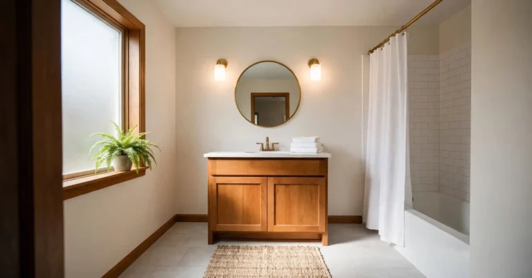
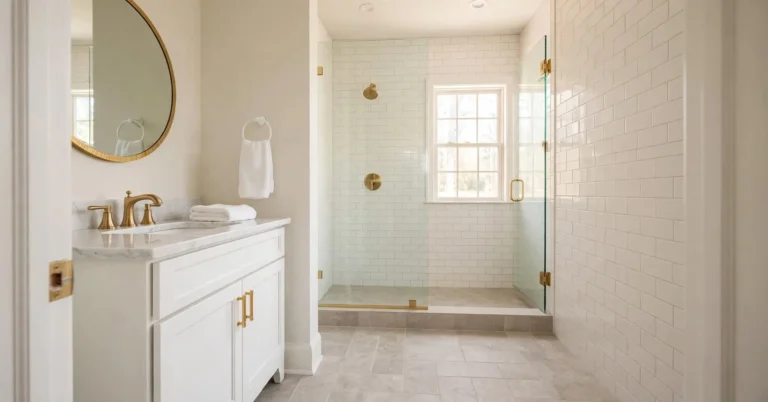
In bathrooms, this paint works best with plenty of light, either from a window or strong overhead fixtures. In small, low light bathrooms, it can look slightly dingy, so consider a lighter percentage or better lighting first.
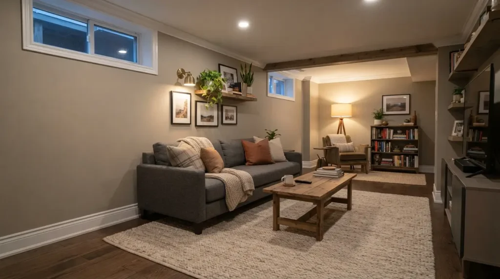
Edgecomb Gray in a Basement
Basements usually lack natural light, and this color handles that better than many neutrals. Because it already leans warm, it does not turn cold and gray the way true grays often do in low light. Pair it with bright white trim to keep the space from feeling heavy.
Edgecomb Gray Trim
This paint is usually too deep to work as a trim white. It can be done in a full color drench look, where walls, trim, and ceiling all match. This only works in rooms with strong architectural detail and good light. For most homes, keep the color on the walls and use a true white on the trim for contrast.
Edgecomb Gray Exterior Paint
Outdoors, this shade works beautifully as a trim or body color, especially on homes with a lot of surrounding trees. It reads as a soft, warm white in strong daylight without looking harsh. It also pairs nicely with deeper exterior body colors like charcoal or navy for a classic look.
Whole House Edgecomb Gray Color Scheme
Edgecomb Gray is one of the better choices for a true whole house color. The same wall color flows through most rooms. Only trim and accents change.
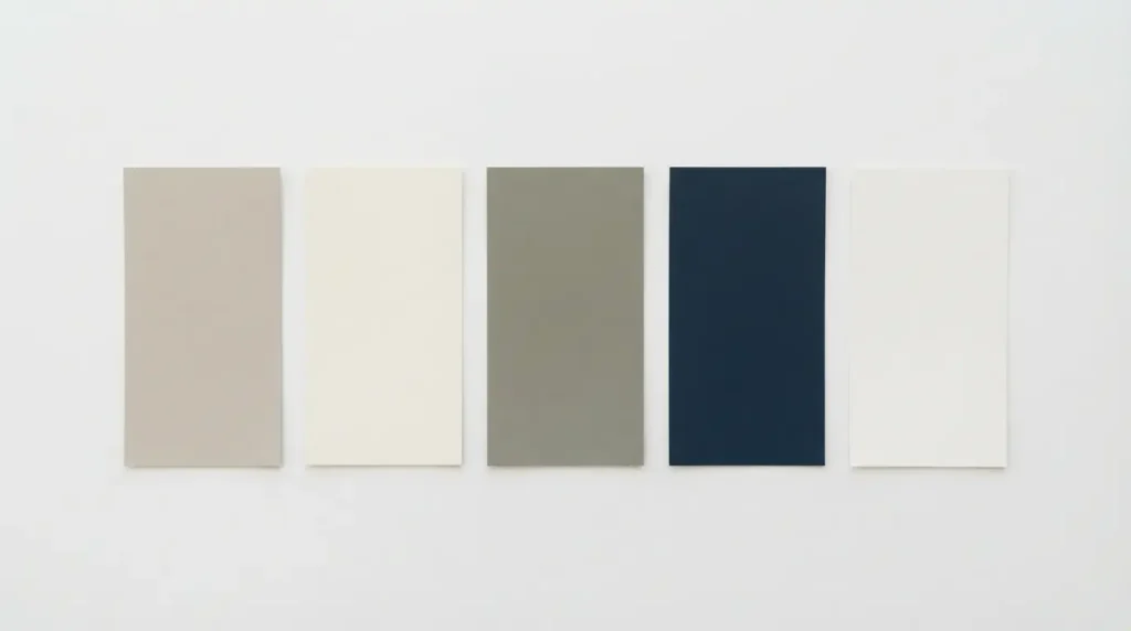
Here is a sample palette that works across an open concept home:
| Area | Color | Role |
| Main walls | Edgecomb Gray HC-173 | Primary wall color throughout |
| Trim and ceilings | White Dove OC-17 | Soft, warm contrast |
| Kitchen island or accent wall | Revere Pewter HC-172 | Deeper anchor tone |
| Front door or accent | Hale Navy or a dark green | Bold contrast pop |
| Exterior trim | Same paint or Chantilly Lace | Ties interior and exterior together |
The reason this works is consistency. The paint shifts gently with light rather than dramatically. It can move from a bright, south facing living room into a dimmer hallway without feeling like two different colors. That flexibility is exactly what a whole house scheme needs.
If your home gets very little natural light, consider using a 25 percent lightened version through the main living spaces. Reserve full strength color for rooms with better exposure.
What Colors Pair Well With It
Best White Trim Colors
Benjamin Moore White Dove is the most popular pairing. It is a soft white with just enough warmth to feel connected, without competing with the wall color.
Benjamin Moore Chantilly Lace offers a brighter, crisper contrast. Choose this option if your room already reads a little dark or if you want the trim to stand out more.
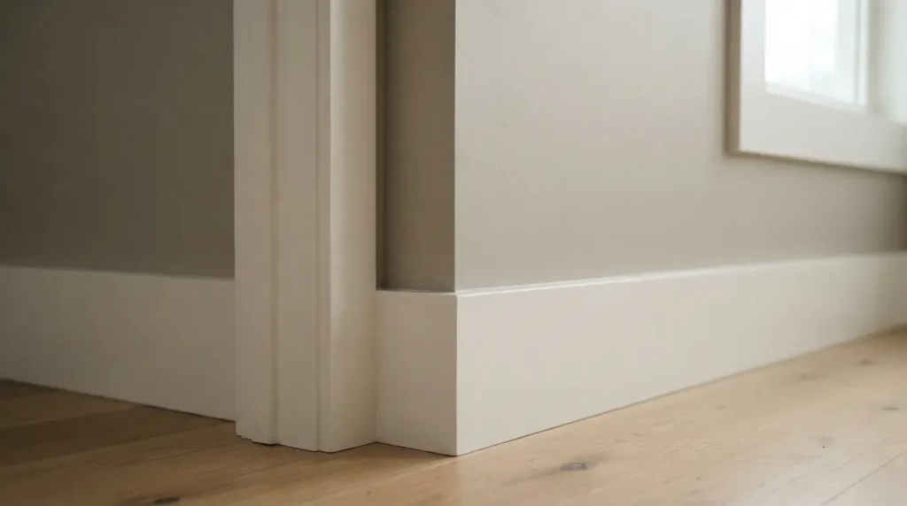
Sherwin Williams Pure White is another strong option, especially for homeowners mixing brands between wall and trim purchases.
Avoid warmer, creamier whites like Simply White or Swiss Coffee. They sit too close in warmth and undertone, so the contrast falls flat.
Does Edgecomb Gray Go With Cream Cabinets or Trim?
No. This is one of the clearest rules in this guide. Cream cabinets carry strong yellow undertones that clash with this paint’s cooler, more neutral base. The pairing tends to look muddy rather than warm. If your cabinets or trim are already cream, choose a different wall color, or repaint the cabinets first.
Does It Go With Wood Cabinets and Trim?
Yes, in most cases. This shade pairs nicely with a wide range of wood tones, including oak, maple, and walnut. The one exception is wood with a strong red undertone, such as cherry stained cabinets or red oak flooring.If you’re unsure what works with that warmth, here’s a guide to colors that go with red.
Best Accent Colors
Deep, earthy greens work beautifully, since both colors share a similar temperature. Blue green grays, sometimes called stormy grays, also make strong accent choices. Darker greige tones, at least ten LRV points below the wall color, add depth without clashing.
Avoid pairing it directly with violet gray colors like Collingwood or Balboa Mist. The green base here and the violet base in those colors cancel each other out, leaving both looking flat and lifeless.
Alternatives and Comparisons
Edgecomb Gray vs. Revere Pewter
These two colors sit next to each other on Benjamin Moore’s paint deck. They are not simply light and dark versions of the same formula. Revere Pewter has a lower LRV near 55, giving it more depth and a slightly muddier, earthier warm gray tone. Edgecomb Gray is lighter, cleaner, and more versatile across different lighting conditions. Choose Revere Pewter if you want a moodier, cozier neutral. Choose the lighter option if you want something brighter and more flexible.
Edgecomb Gray vs. Accessible Beige
Sherwin Williams Accessible Beige sits close in spirit, but the two behave differently. Accessible Beige has an LRV near 58, making it slightly darker. Its undertone leans more heavily yellow, giving it a warmer, sunnier feel. Edgecomb Gray stays more balanced and neutral, without leaning as far into beige. If your room already gets strong warm light, the Benjamin Moore option is the safer choice. If your room feels cold and needs extra warmth, Accessible Beige may work harder for you.
Edgecomb Gray vs. Pale Oak
Pale Oak is the lighter, airier cousin in this neutral family, with an LRV near 69. It reads almost as a soft off white, while Edgecomb Gray reads as a true, present neutral color. Choose Pale Oak for ceilings, trim, or rooms that already have plenty of contrast. Choose the deeper option when you want the wall color itself to carry real presence in the room.
Edgecomb Gray vs. Agreeable Gray
Sherwin Williams Agreeable Gray has an LRV near 60 and leans slightly more violet gray. The Benjamin Moore shade is lighter, cleaner, and stays more consistently warm across different rooms. Agreeable Gray tends to shift more dramatically depending on lighting.
Edgecomb Gray vs. Manchester Tan
Manchester Tan shares the exact same LRV and undertone family. It reads slightly more beige. The original reads slightly more gray. Some designers pair the two together in the same home. One goes on the walls. The other goes on a connected space like a hallway or staircase.
Best Sherwin Williams Equivalent
Sherwin Williams Accolade is the closest match in that lineup. It shares a similar undertone and light range, though it reads slightly more muted. It is a solid substitute for homeowners committed to a specific paint brand for other parts of their project.
Common Mistakes to Avoid
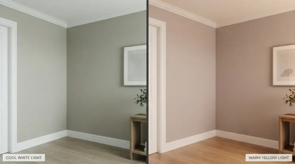
It looks too green. This usually happens under cooler LED bulbs or in rooms with heavy outdoor foliage reflecting through large windows. Try warmer bulbs, closer to 2700K, and retest.
It looks too pink or mauve. This often shows up next to cream trim or warm wood floors. Low Kelvin lighting at night makes it worse. Balancing the room with a slightly cooler white trim can help offset it.
It looks dingy or muddy. This is almost always a low light problem. Rooms with small windows or north facing exposure need extra help from artificial lighting to keep the paint looking fresh rather than flat.
Does it work in a small room? Yes, though it will make the space feel a bit more grounded rather than expansive. If you want the room to feel larger and brighter, use a lightened version, around 25 to 50 percent. Pair it with a bright white trim to keep the contrast crisp.
Pros and Cons
Pros:
- Works in both bright and low light rooms
- Flatters most wood tones, including cabinets and flooring
- Reads as a true neutral without feeling cold
- Strong resale value due to broad appeal
- Performs well as a whole house color
Cons:
- Undertones can shift unpredictably without sampling first
- Clashes with cream cabinets and trim
- Fights with violet gray tones like Collingwood
- Can look dingy in rooms with very little natural light
Final Thoughts:
Edgecomb Gray earns its reputation as one of Benjamin Moore’s most reliable neutrals. It works across kitchens, living rooms, basements, and exteriors. It flatters wood tones and pairs well with warm white trim. Its only real weakness is unpredictability under certain lighting, which a proper sample always solves. If you want a warm, flexible neutral for almost any room, Edgecomb Gray remains one of the smartest choices on the market today.
Frequently Asked Questions:
Is Edgecomb Gray the light version of Revere Pewter?
No. While they sit near each other on the paint deck, they have different undertones and different personalities. Revere Pewter is deeper and muddier. The lighter option is cleaner.
What is a good ceiling color to pair with it?
Most homeowners use the same white as their trim, such as White Dove, to keep the room feeling connected and uncomplicated.
Does it work with black trim or fixtures?
Yes. Black trim and hardware create strong, clean contrast without clashing with the undertones. If you want to go bolder, see how black works as a full room color in black bedroom ideas.
Is it good for resale?
Yes. Its broad, neutral appeal makes it one of the safer choices for homeowners preparing to sell.
Can I use it for a whole house without it feeling flat?
Yes. Vary the finish and depth slightly. Add a deeper accent like Revere Pewter in one or two rooms. The whole house will not read as one flat tone.

About Author
Hello there. I am Lathen Reed, a home improvement and interior design enthusiast. With a passion for creating beautiful, practical, and comfortable spaces, I share helpful ideas and inspiration related to home improvement, home decor, interior design, and home styling. Through HomeFixStyle, my goal is to make home improvement simple, inspiring, and accessible for everyone.